New Welcome Signs for Rye Town Park
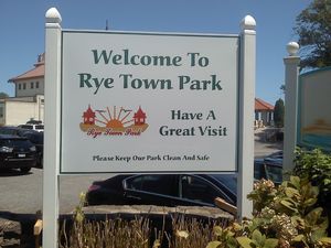
(PHOTO: In with the new…)
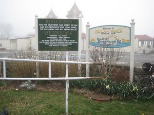
Rye Town Park is presenting a new look to visitors as they approach the park from any of its “four corners.” The park’s old signs were dark and hard to read, and they contained mainly a list of things that were not permitted at the park.
A sign committee was created in January of this year (some rip-roaring late night meetings, I tell ya…). They submitted their proposal for new welcome signs to the Commission in May, and the design was approved in June. The four new signs were installed by the park’s maintenance staff on July 25 and 26.
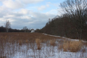
(PHOTO: Out with the old…)
The “Welcome To Rye Town Park” letters are nearly 5 inches high – 25% higher than the largest letters in the old signs. The sign also includes the park’s logo, which is the iconic towers of the original 1909 bathhouse building, along with the sandy beach, seagulls, and a bright, rising sun. The signs convey three brief messages: visitors are welcome; the Commission wants everyone who comes to “have a great visit”; and they ask everyone to help “keep our park clean and safe.”

